With ever-growing and complex ecosystems, it becomes unmanageable to end up with a single picture that can both exhaustively capture the whole scope and be properly processed by standard human being. When facing such a situation, splitting the overall problem into chunks, layers or levels, which focus on a dedicated set of aspects instead, is a common way to address the issue. Humanity has been treating geographical maps this way for centuries, moving back and forth, from continent to country, from country to region, …
Zoom consistency
Main idea is to ease elements identification and coupling, while clustering information details to the level it is pertinent to. Zoom levels are not mixed to avoid discrepancy. Most of the geographic maps we are exposed to stick this pattern.
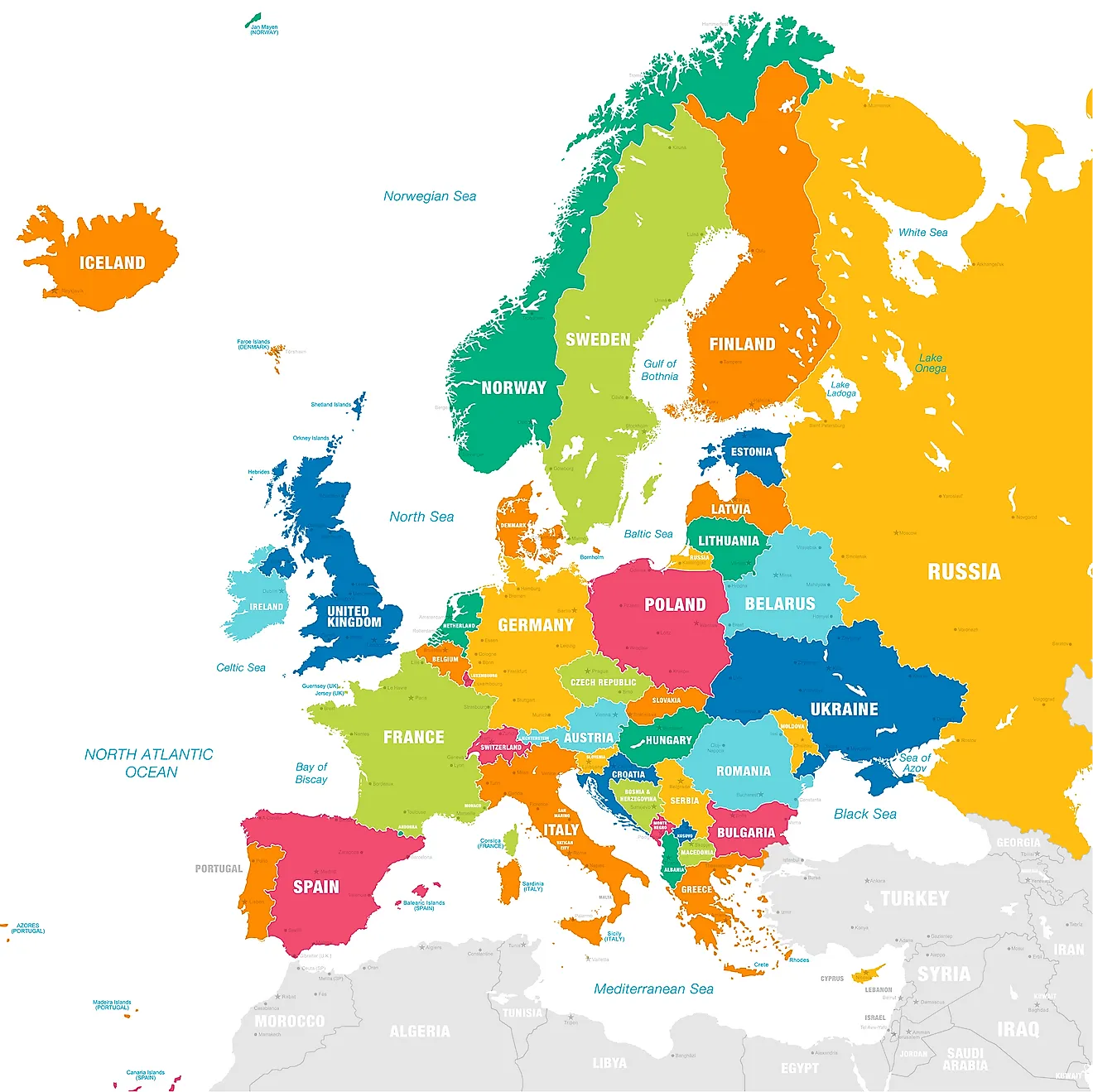
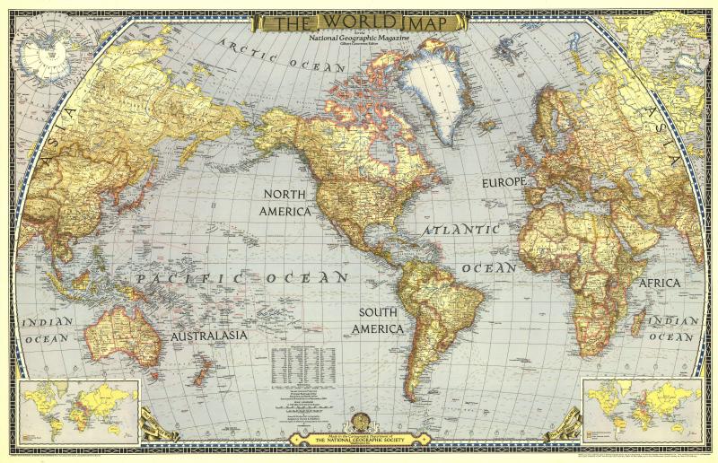
World

Typical international map. Notice how every country is fairly dealt with: name, color, boundary. No insights.
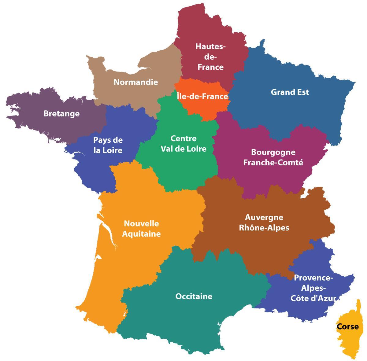
Country

If we focus on France, we usually end up with first level of granularity, known as region. Once again, fairness treatment.
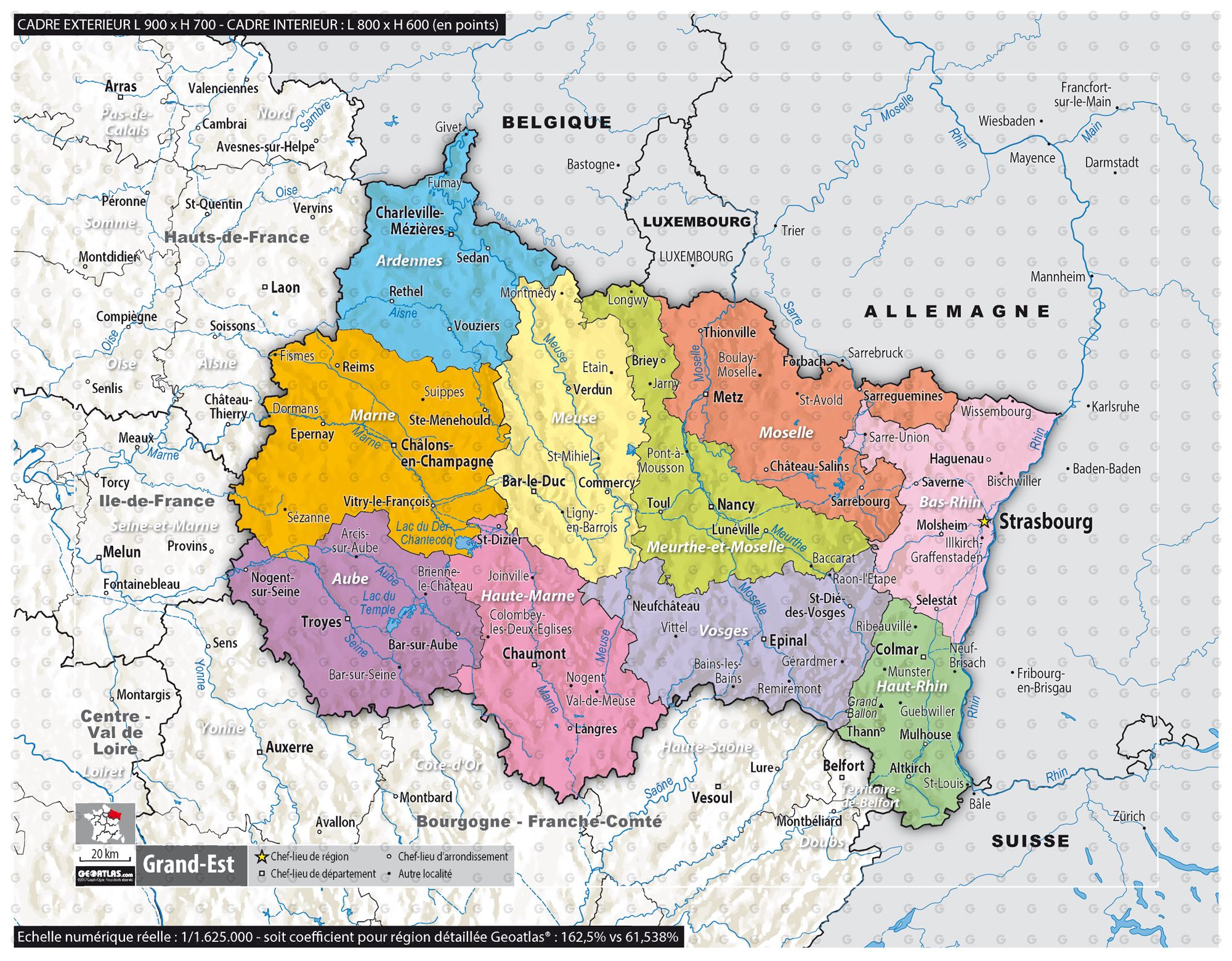
Region

Zooming one last time to department layer. Notice how context is provided through gray neighboring without noising the focused area (the colored one). And once again, each department or dependency is equally processed.
It is vital to decrease mental workload to cluster information by introducing this level of consistency or treatment equity. Two obvious usages you may encounter:
- Assuming you introduce new materials to layman audience. Sticking to zoom consistency will avoid flooding the audience and will gently support them along the path of enlightenment. Otherwise, ensure you will lose a couple of them if you are lucky, more if you aren’t…
- Assuming you process complex materials with expert audience. Sticking to zoom consistency will enforce focus and prevent digression. Cognitive energy won’t be deflected, and you are likely to end up with smarter outcome.
Anti-pattern
Refrain yourself to aggregate heterogenous things, it will defeat any purpose. As appealing as they could appear at first sight, exploded or multi-layer views are but marketing ones. By trying to chase multiple problem dimensions, they eventually get neither one properly. In addition, they are very hard to process efficiently, as our brain is constantly switching context, meaning it ruins its cache locality.
DRAFT’EM ALL AT ONCE MAKES ME SHINE (AT LEAST, I BELIEVE IT DOES…)®
- What is the important feature?
- What is the important level?
- Why this asymmetry or unfairness processing?
- What about the targeted audience?
- What about the information or the message you would like to convey at the end of the day?
Wondering about any or all of those questions every single time you are fed with the above diagram means cognitive power you allocate to effectively think about the problem will be reduced accordingly. Such waste of time and effort for pointless processing.
Closing
We are exposed to geographical materials, more or less since we learned how to read and write, meaning an outstanding while for many of us… Therefore, it should have been straightforward to daily replicate this pattern and leverage this acknowledged paradigm. One may wonder why it is not really the case, as a significant part of the materials we craft or are exposed to goes astray… It is now up to you to come back on track!
