PITCH
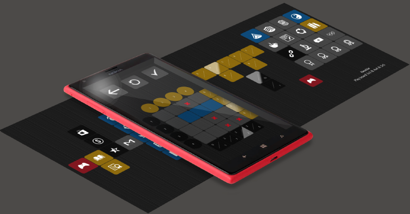
Welcome to Kakurasu world, a place where uncluttered tile-based design is dedicated to challenging and addictive gameplay. With only mental arithmetic and deduction for weapons, master these lovely crafted puzzles. In Kakurasu world, all is about properly filling a board to satisfy given targets. Start your journey with easy-peasy levels then sharpen your mind facing highest ones and so called hidden mode… Funny achievement system rewards your progression and keeps you focused on training your brain.
DESIGN
UNCLUTTERED
Kakurasu is a Japanese puzzle. As a proper tribute to its origin we imagine Kakurasu as an uncluttered experience. Every single bit is important, no embellishment is allowed. However we refuse to use a traditional Japanese style – as it is often the case for similar puzzles – and opt for a modern style to dust this at first sight austere brain-teaser.
ICONOGRAPHY AND TILE
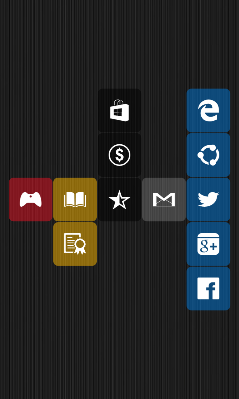
Iconographic tiles are per se the essence of modern Windows ecosystem. As we want our game to act as a built-in module inside this world we eagerly feed our game with them. We literally use iconographic tiles as raw materials as soon as we think about design.
TRANSPARENCY
Tiles are good. Transparent tiles are better. Microsoft himself agrees with that by introducing transparency for tiles in windows 10. Transparency visual effect makes whole design slight and airy.
SQUARED BUT ROUNDED
We previously talked about tiles. Here at Aku Studio we love tiles. But we love them squared. We love them rounded. We love the smooth curve rounded corners introduced. We love grid’s intersection pattern rounded corner highlighted. We love the inherent duality between tiled-grid squared-layout strict feeling and rounded corner sweet experience. You will see: windows phone 7 introduced tiles, windows 10 introduced transparency for tiles, next iteration will introduce rounded.
USER EXPERIENCE
CRYPTIC MENU
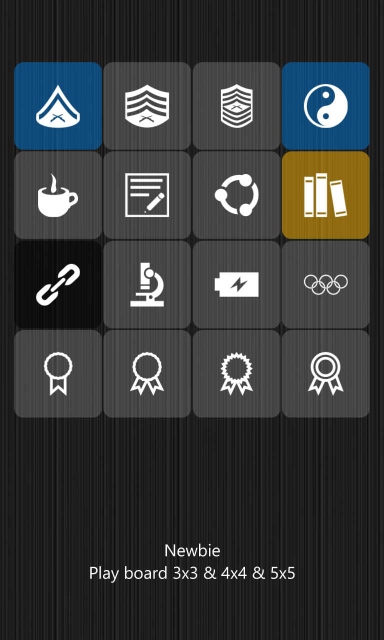
At Aku Studio we like cryptic menu. Even if we try hard to make every single tile self-explanatory by properly choosing its content and this way fit to the universal language modern UI is based upon, the lack of textual hint could be disturbing for some users. Curiosity is definitively a great motivation when it comes to video game.
PANORAMA
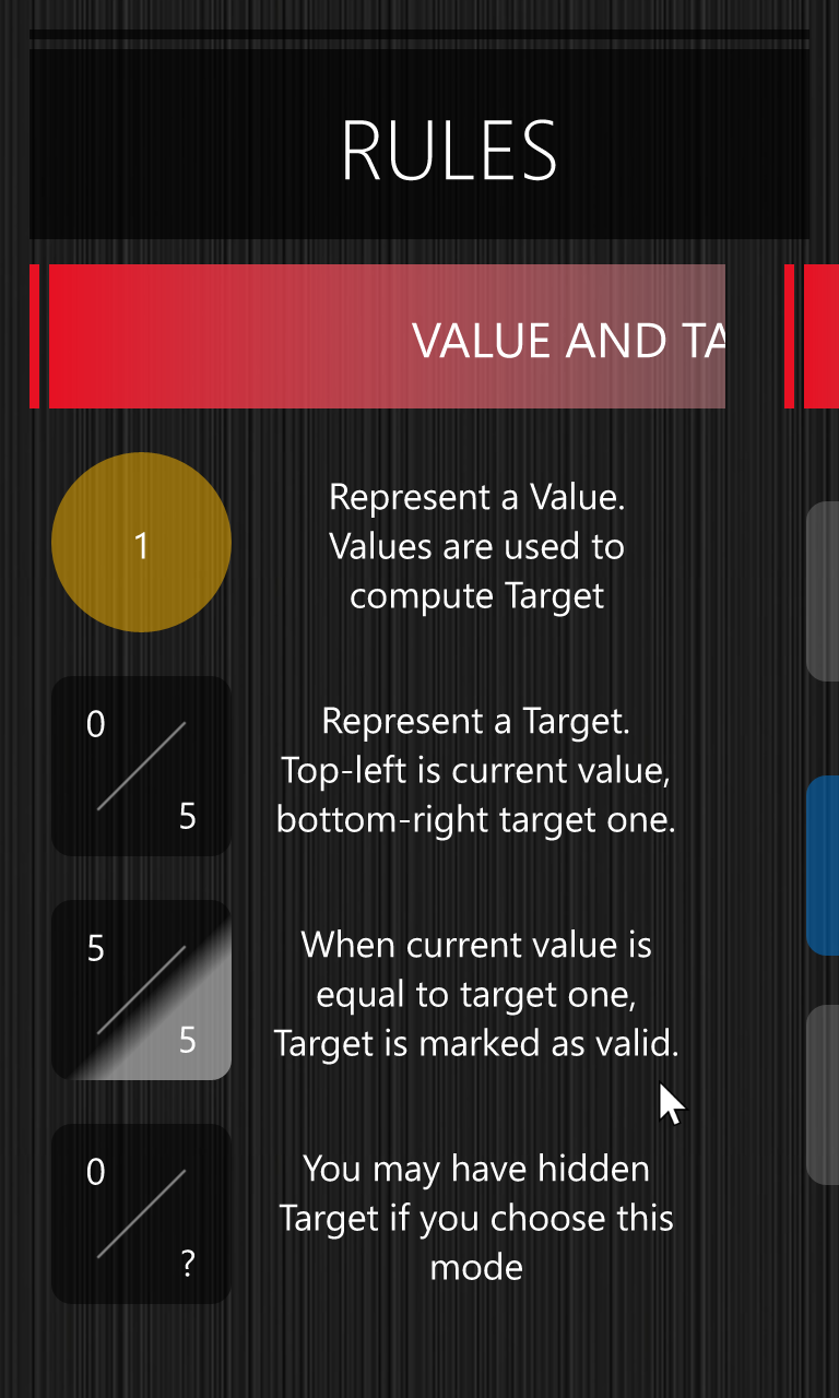
By choosing iconography you do not have to use verbose text to express ideas. Furthermore, you drastically reduce the time you will spend dealing with localization and internationalization. Same as killing two birds with one stone. We miss disavowed Panorama. We especially liked the way it was designed. It was a great mechanic – one more time based on curiosity – to encourage users exploring further. We decide to revamp it to handle our rules section by splitting available display space into two: one main part showing the active section, another smaller one acting as place holder for the next one preview.
MISSING LINK
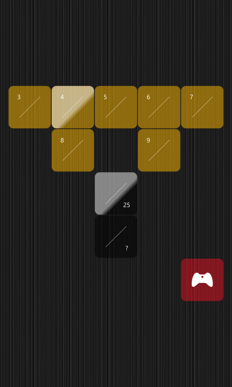
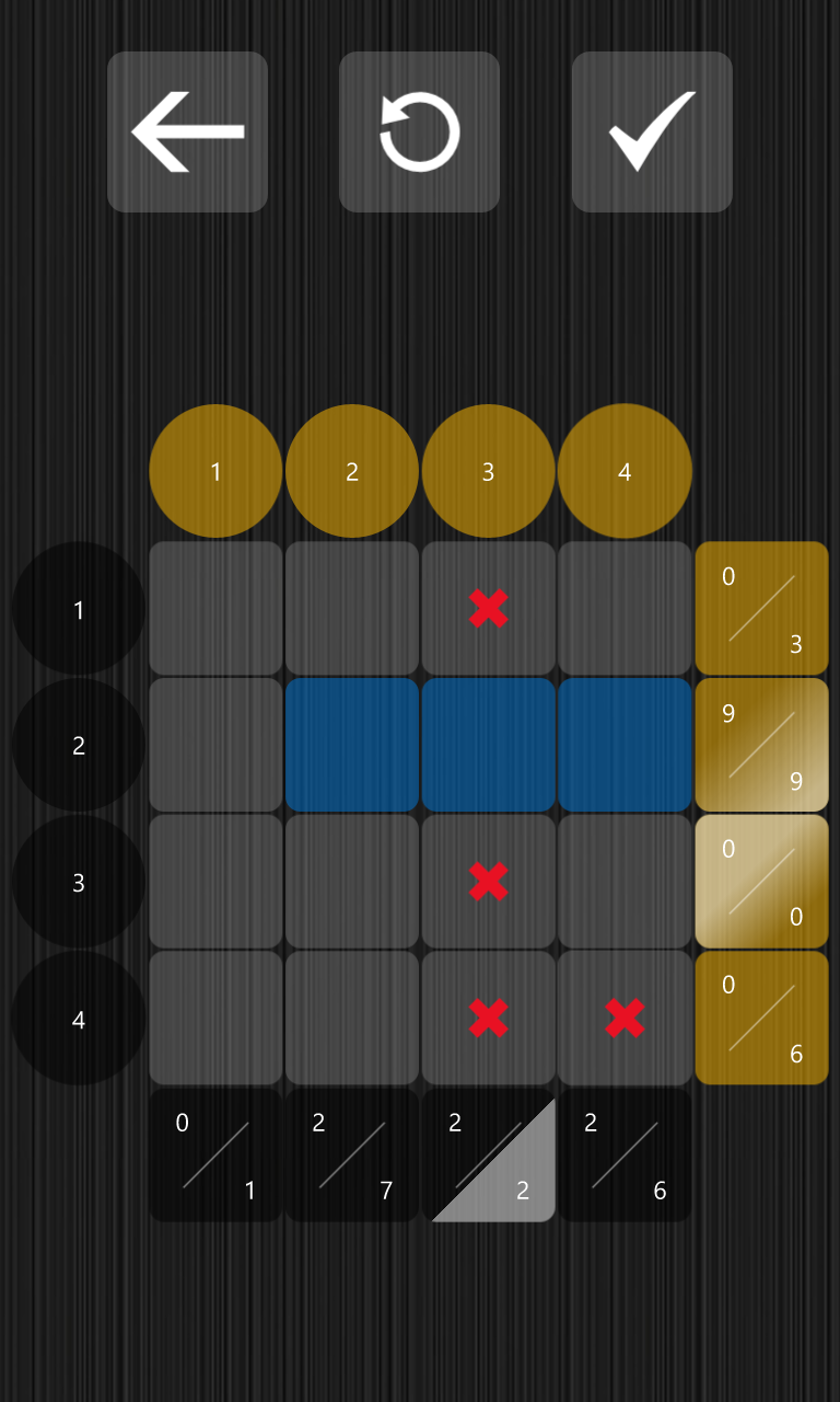
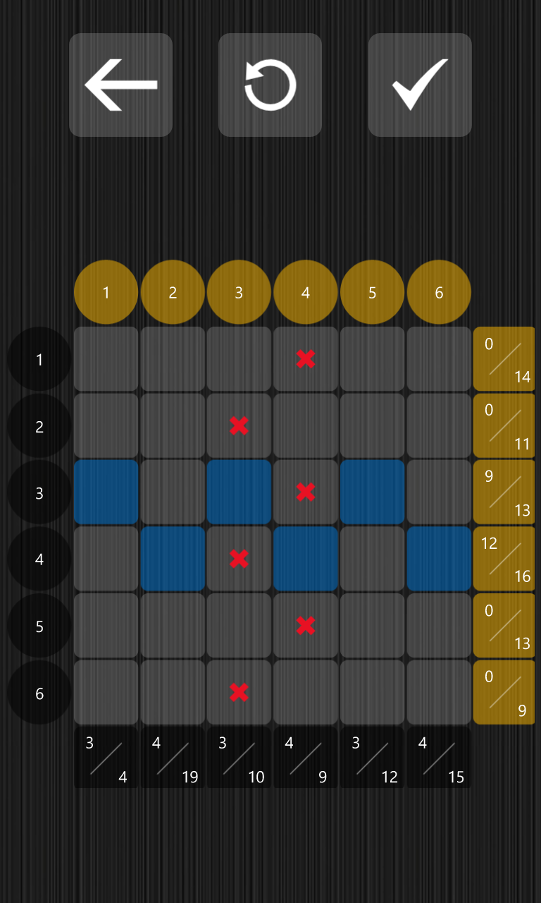
The first difficulty when we approach Kakurasu for the first time is to decipher what appends when we change the state of a square. Especially the link between values and targets. To make it perfectly clear we decide to pair values and targets by applying a color pattern. Color is another kind of universal language. Brain is trained to automatically sort data taking into account color information. The way we design the board makes it easy for newcomer to catch game mechanics.
ACTIONS
Kakurasu is all about mental arithmetic and deduction. All of us are not Kasparov twin and able to solve puzzle right the first time. To help user we introduce two helpers. Undo is very popular in brain-teaser game as it allows to rollback last move(s). This way user can experiment and revert to previous state if necessary. Hint allows user to check the current state of the board and highlight both good and wrong moves. It could even be used as a checkpoint mechanism as good ones are marked and frozen. This way we can solve the puzzle step by step. Experiment by making some moves. As soon as you are satisfied introduce a new step. Repeat the process.
CONTINUOUS PLAY
Mobile gaming is often a short session story. And by short we do not only speak about duration but about uninterrupted timespan too. User can will be interrupted in the middle of something. By a call. By a bus or subway stop. By anything else. In this world, compulsory feature is to provide an automatic last game saving. We do. Moreover, we choose to store current game to the user roaming context. This way you literally start your game on your desktop and finish it on your phone. Continuous play experience…
DEVELOPER CORNER
BACKGROUND
We use seamless texture and leverage Windows.UI.composition to cope with all screen sizes. This way background image always displays nicely whatever the device.
PATH
Universal Windows Platform interface is XAML based. One of the greatest advantage over competitors is that XAML is vector graphics. And when we talked about responsive design this simply makes the difference. Instead of providing multiple assets to (try to) target every type of devices we simply rely on Path. Whole Kakurasu interface is based on Windows.UI.XAML.Shapes.Path. Not only properly scaling in and scaling out are no more burning issues but application package size is lighter too as you do not have to embed huge image assets anymore.
RESOURCES
XAML framework urges developer to make intensive use of themes and resources to provide both engaging and customized interface. Not so known feature is you can define per-device-family resources dictionary the way you do for page. This way you can customize styles and resources to cope with all types of device. We did it for text in Kakurasu to ensure everything is properly displayed whatever the target device.
BOARD
Kakurasu experience is mainly based on squared elements: menus and board. To ensure those last are always properly displayed, especially on desktop when user can resize game window we leverage a three steps processing:
- Every menu or board is a single container with multiple heterogeneous content ie we do not have specific lines and columns for values and targets and a separate grid for squares and try to layout this bunch: we use a single grid. This way we always nicely display or resize everything as one. To achieve this we use a
Windows.UI.Xaml.Controls.DataTemplateSelectorto dynamically switch graphic display according to the underlying element. - We attach a homemade behavior – inheriting from
Windows.Xaml.Interactivity.IBehavior– to enforce squared attribute. Behaviors are a good way to encapsulate functionality into reusable component. See them as user control decorators. - Embed the whole stuff inside a
Windows.UI.Xaml.Controls.ViewBoxto ensure that all available space will be properly filled by the menu/board and you are done.
